


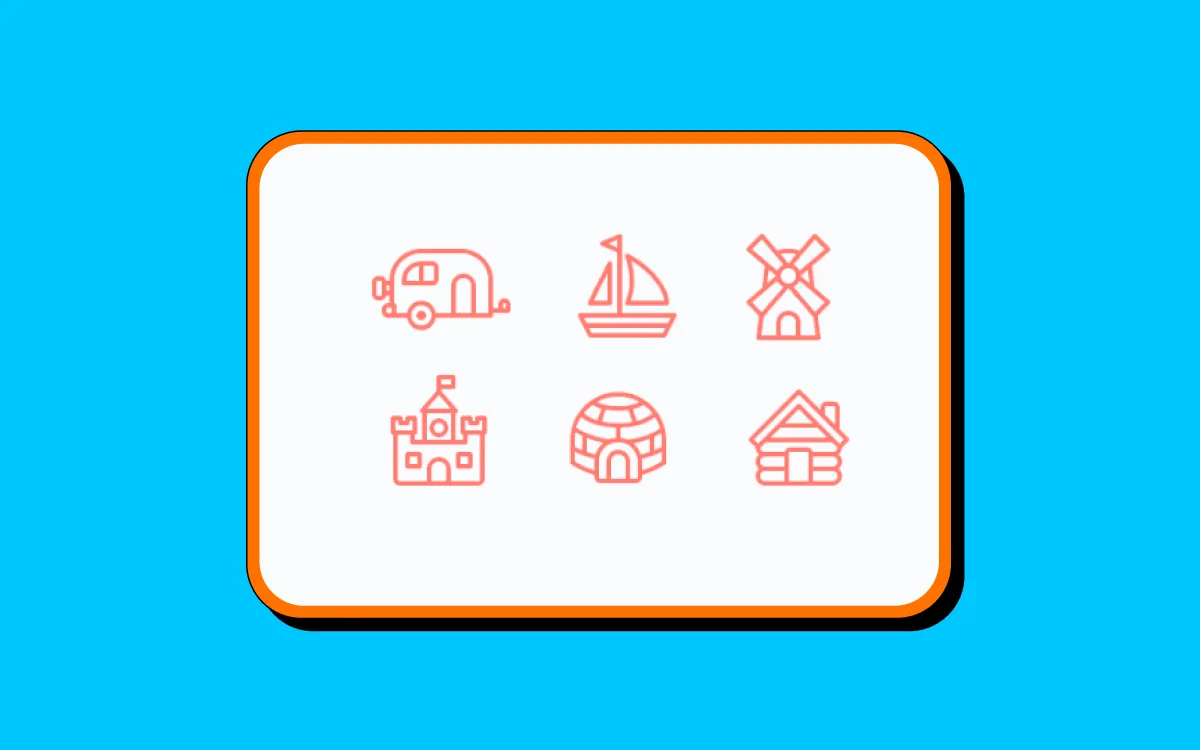
inspiration
We’re talking unified colors, logos, and icons for seamless interaction between touchpoints across the web.
Omnichannel engagement is on the rise for ecommerce brands in 2024. As we swipe from one brand platform to another brand platform in just a few seconds, brand consistency has never been so important.
We’re talking unified colors, logos, and icons for seamless interaction between touchpoints across the web.
With the average person now using more than 6 different social networks a month, it’s important that you provide pathways to each platform from your website, email newsletters, and social feeds themselves.
Improving your icon UX to boost omnichannel engagement is crucial not only for creating a positive UX experience on your website but also for encouraging continued engagement on social platforms, where leads can interact more frequently with your brand.
With this in mind, we’ve put together six brilliant ways to enhance your icons on and off your website for omnichannel success.
Before we jump into the best strategies for icon optimization, let’s have a closer look at some of the UX trends shaping icon design and placement in 2024:
With icon UX design trends in mind, let’s delve deeper into the world of icon design.
Your social icons should appear on all channels, including competing social platforms. Whether you place icons on your website or on your Facebook homepage, your icons should be easily accessible and provide leads with a quick path to all brand touchpoints.
Here are six ways to ensure your icon placement and design is up to scratch in 2024.
First things first, ensure that your icons are visible and easily accessible from every brand platform. For example, if you’re placing social icons on your website, ensure that they are easily reached in the footer, header, or sidebar.
National Geographic places its social media icons in the footer of each page. This ensures that the icons are visible on each page while not distracting viewers from the main site content.
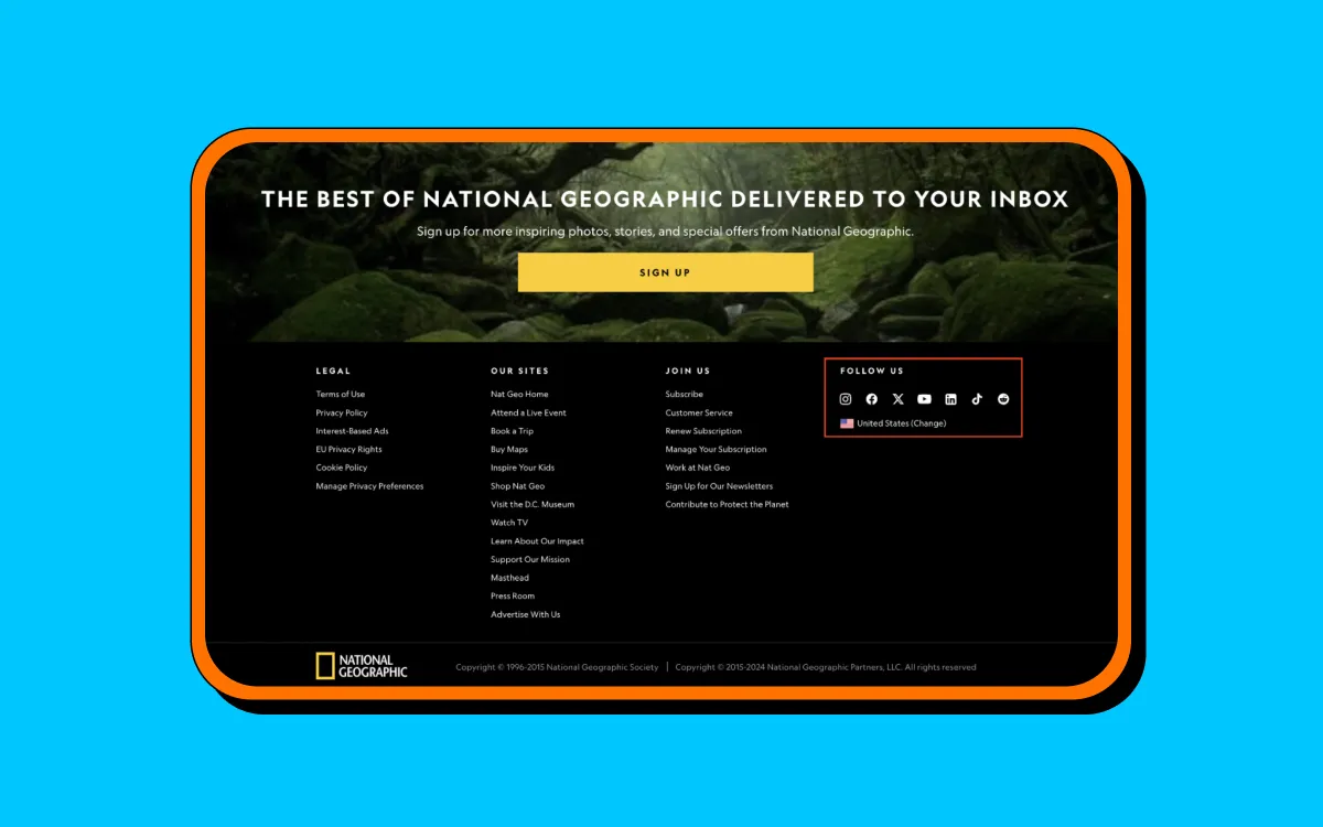
This strategic placement makes it simple for users to discover your icons and quickly jump to your social profiles without having to change to a new app/platform.
Color consistency is crucial if you want to ensure that your brand is recognized on all platforms. While social platform icons should retain their original designs and colors for recognisability, your original brand icons can be adapted to fit in with your brand’s color palette, size, and style.
Take Coca-Cola, for example. Their classic red and white design is applied to their Instagram feature icons, as well as their highly recognizable logo, to ensure that their Instagram homepage is uniform with their other marketing materials.
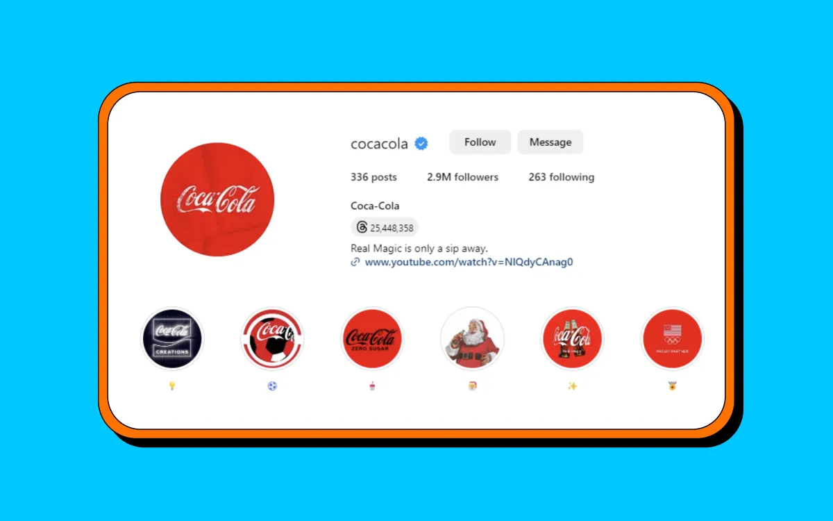
This consistency helps improve brand recognition in an omnichannel environment and ensures that users have a seamless transition between platforms.
In 2024, 64% of online searches are carried out on a mobile device, meaning that your website must be well-optimized for a mobile-friendly experience.
Your social icons are no exception and should also be adapted to suit a mobile audience. This includes making icons easily clickable, introducing touch targets, and considering a placement likely to be visible to a smartphone user.
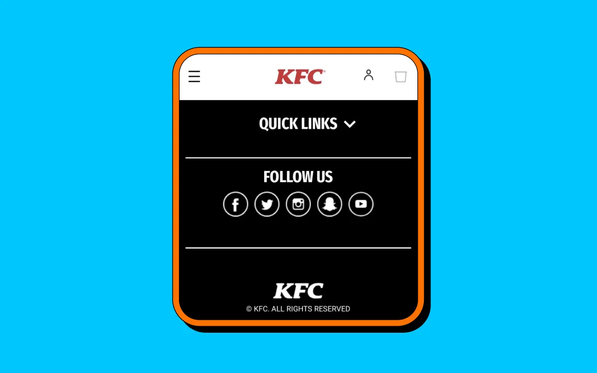
Take the fast food brand KFC, for instance. Their mobile site features easily tappable social icons in the footer, which allow easy access via scrolling while not interfering with other content and compromising the smartphone experience.
Smartphone users are the most likely to engage with social icon CTAs, so ensure that they are visible and easy to interact with on all smartphone devices.
While many opt for generic social media logos, other brands get creative with their iconography. This is especially useful if you’re also linking out to other web pages, partnering brands and services.
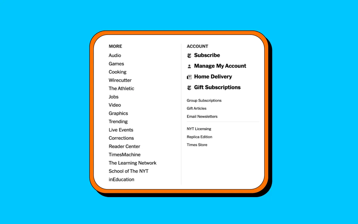
The New York Times has incorporated its site branding into its icon design. Its icons for subscriptions, account management, and other navigational touchpoints take inspiration from its famous typography style and minimalistic black-and-white color palette.
Introducing custom icons for all touchpoints, alongside social icons, can help your icon design become part of your overall brand identity rather than just an afterthought.
Next, let’s discuss animation. Animated icons can respond to any user action, such as clicking or even hovering. This makes your icon engagement more interactive and encourages users to start clicking.
Airbnb is a master of animated iconography. It splits its website into sections and uses playful icons to help users navigate to their dream destination. Users can enjoy social icons that change color when hovered on and page icons that enlarge when interacted with.
Animation helps a user draw attention to an icon and enhances the overall UX experience as you bounce from channel to channel.
While social icons are most often found at the header or footer of a website, this is not the only place they could gain engagement for your brand.
Why not also include your icons within brand videos, newsletters, and email campaigns to double the impact and increase your chances of user interaction?
The key here is to know your audience inside and out. If you have the chance to promote a social media platform using an icon CTA, choose your social platform wisely. If you add social icons your demographic recognises, they are twice as likely to interact.
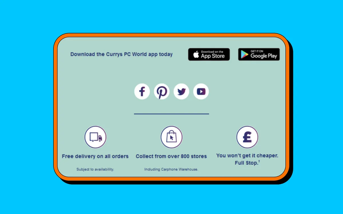
Currys PC World does this well by including large icons within its newsletter template. The icons are designed to match the company's email style and aim to seamlessly send readers to their next touchpoint platform.
As we embrace omnichannel branding, clickable icons open doors for leads to discover new platforms and increase a brand’s chance of converting customers.
Your icons alone can significantly raise user engagement cross-channel, so it’s crucial that you prioritize consistent branding, strategic placement, and creative features when adding them to your UX design.
Following in the steps of brands like Coca-Cola and Airbnb, ensure that your icon design is thoughtful and accessible for users interacting with your brands from all touch points.
Omnichannel marketing is here to stay, so any steps you can take to carve out a seamless path from platform to platform will see your brand engagement skyrocket in 2024.

